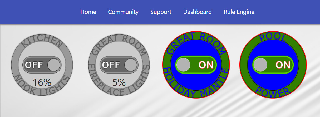
I’m trying to understand the layout behavior of the Thing tile status/footer on Android.
I realize custom CSS isn’t officially supported, so I’m not asking for help writing CSS. I’m trying to determine whether I’m running into a limitation of the Thing tile layout itself.
Here’s what I’ve observed:
-
I created a new test dashboard containing only four Thing tiles.
-
Two are dimmers displaying a percentage (5% and 16%).
-
Two are switches.
-
The behavior is the same on my full dashboard and on this minimal test dashboard.
On my Samsung S25:
-
In portrait, the percentage text moves to the top of the tile.
-
In landscape, the percentage moves much lower.
-
The switch tiles don’t exhibit the issue because they don’t display a footer value.
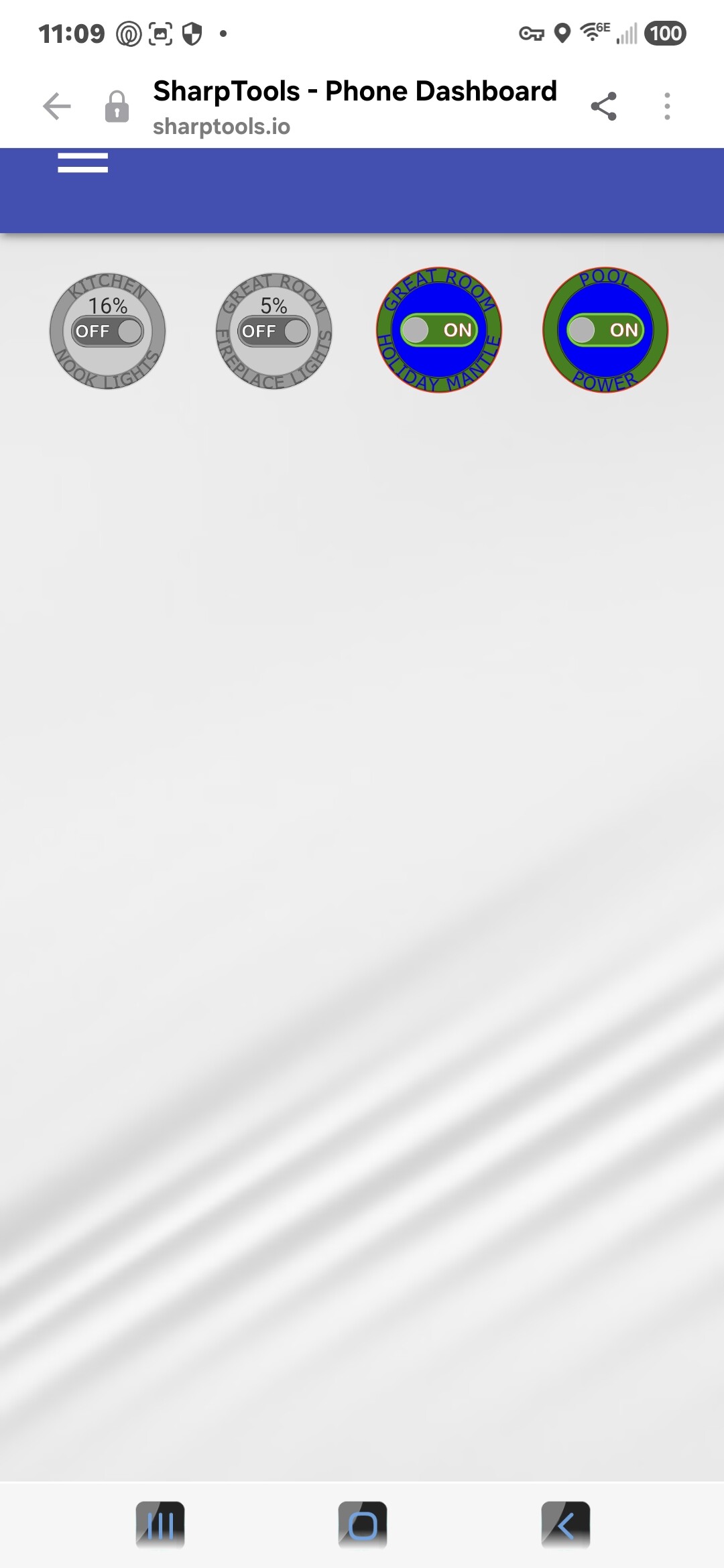
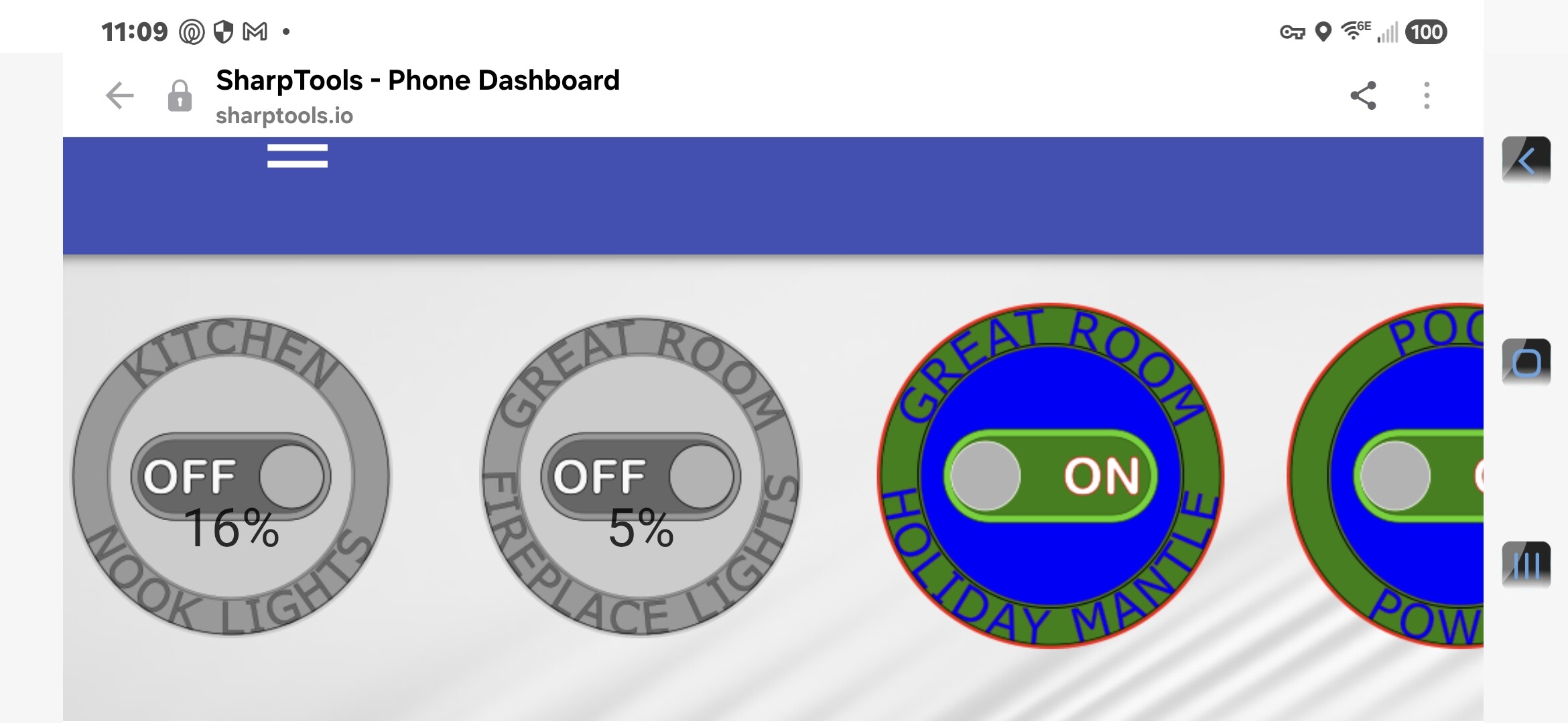
I also connected Chrome Remote Debugging (ADB) and inspected the live page on the phone.
What I found:
-
The HTML is the same.
-
The computed CSS is the same.
-
The difference appears to be how the footer/status is laid out or positioned after the page is rendered.
My question is:
Is there something about the Thing tile layout that intentionally positions the footer/status differently between portrait and landscape on Android?
Or is there another supported way to position or display the device status/percentage independently of the built-in footer?
I’m just trying to understand whether this is expected behavior before I spend more time trying to work around it.
Thanks!
EDIT: …and this is on a desktop computer.